Using a Responsive CSS Grid with Relative Measures
When you build a web site on a CMS and a theme made by someone else you always have some limitations. For this blog I use WordPress and the Montezuma theme, and this is how I customised the default CSS grid options to my liking.
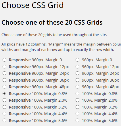
These are the grid options you can choose from in version 1.2.4 of the Montezuma theme. Not bad at all, but if you want to use a responsive layout (and yes, you should) you have to choose between a fixed 960 px maximum width or use the 100% width option which can become ridiculous on large high resolution screens. So, what I did was to choose the 100% option and then add max-width to constrain the width. This was an easy way to achieve what I wanted with a minimal adjustment and have relative widths, which I really prefer in a CSS grid system.
Using Chrome Developer Tools I identified the CSS rule that determines the page width.
Now the only remaining thing was to add a new rule with the same selector defining the max-width I found appropriate – which I did to in the content.css file like this.